Azure Plan Cost Management Dashboard
- Panagiotis Papanastasiou
- Oleg Melnykov (Deactivated)
Current and historical data can help manage costs when analyzing usage and costs over time to identify trends. Trends are then used to forecast future spendings. For that reason, we have introduced a new section named "Cost Management" inside the Azure Plan Subscription-View page in the Storefront where we display all the Azure Plan's usages (current and previous consumption) as well as forecasts, by utilizing filters and groups.
Accessing the Cost Management of an Azure Plan Subscription
Under the Azure Plan Subscription-View page in Storefront, you can find the Cost Management sub-section, in which two main tabs are available to interact with. The first one being the Cost Management Table and the second one being the Cost Management Charts. Each tab offers slightly different viewpoints of the data related to an Azure Plan Subscription along with its entitlements in terms of their cost management. By default, the "Cost Management Charts" will appear first during the loading of the Subscription's view page. However, let's first analyze the Cost Management Table and then proceed to the Cost Management Charts.
Cost Management Control Options
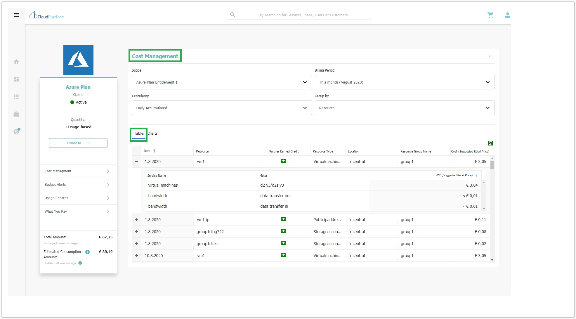
In the Cost Management section, you will find five options, in the form of drop-down list filters, that are available for differentiating the views of both the current and the previous consumption data on both tabs (table & Charts). The first filter, called Scope, consists of the Azure Plan as well as the Azure Plan's entitlements. The second filter, called Billing Period, consists of the current as well as the previous billing periods displaying the data exactly as the Azure Portal. The third filter, called Granularity, consists of three sub-filters that define how detailed the view of the table data will be, and the fourth filter, called Group By, defines how the usages are being grouped and displayed. The last filter, called Chart Type, dictates the type of graphical representation that the Chart will have and it appears only when the "Charts" tab is chosen. 
- Scope: The "Scope" is a filter for the Storefront user to define whether he wants to view the Azure Plan's Subscription consumption in its entirety or just one of its Entitlements' consumption.

- Azure Plan's subscription consumption (default option): This value is chosen by default in the drop-down list, whenever the "Table" tab is selected and depicts on the Table view, all the entitlements cumulatively. Also, the table's column, named "Subscription Name" will indicate the Entitlement to which the consumption corresponds to.
- Entitlement's consumption. The other values to be chosen from the drop-down list can be any Entitlement from that specific Azure Plan. Every time an "Entitlement" is selected in scope, all the resources contained within that Entitlement are being displayed on the Table view.
- Billing Period: The "Billing Period" filter defines which usages are being displayed based on a specific period of time. In order for the Storefront user to be free to select a wide range of time (strictly within a year) of the Azure Plan's billing period, we have implemented a "Custom Date Range" where the Storefront user is able to select any start/end date he wishes, either in the future or in the past. If future dates are set within the "Custom Date Range" option, then the chart will depict only forecasts, which are explained further below.

- This month (default): It depicts data from the first day of the current month until the current day.
- Last 7 days: It depicts data from the last six days as well as the current day. Please know that the current day might be partially or fully be depicted as a forecast bar.
- Last month: It depicts data from the past month.
- Last 3 months: It depicts data from the past three months.
Custom Date Range: With this option, you can choose your preferred (Start and End) dates from which you wish to depict data on the bar chart.

- Granularity: The "Granularity" filter defines the level of detail that the data on the table can present.

- Daily (default): This option depicts, for the selected billing period, the current consumption of each day.
- Daily Accumulated: This option depicts the daily cumulative consumption. This option is applicable only in the Chart view.
- Monthly: This option depicts, for the selected billing period, the consumption of each individual month. Each time the Storefront user changes the "Granularity" the table displays only the usages based on the chosen option. Therefore, when this option is selected, then the data are being grouped per month irrespectively of the "Billing Period".
- Group By: The "Group by" filter defines how the usages are being displayed based on different groupings. The default grouping option currently is the Resource.

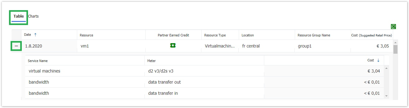
- Resource (default & with expandable rows): The consumption on the table is displayed in seven distinct columns, namely: the Date, the Resource, the Partner Earned Credit, the Resource type, the Location, the Resource Group Name, and the Cost (Suggested Retail Price).
- Location: The consumption on the table is displayed in three distinct columns, namely: the Date, the Location, and the Cost (Suggested Retail Price).
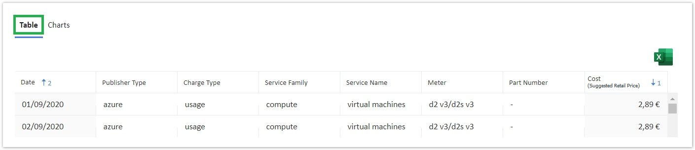
- Meter: The consumption on the table is displayed in eight distinct columns, namely: the Date, the Publisher Type, the Charge Type, the Service Family, the Service Name, the Meter, the Part Number, and the Cost (Suggested Retail Price).
- Resource Group Name: The consumption on the table is displayed in three distinct columns, namely: the Date, the Resource Group Name, and the Cost (Suggested Retail Price).
- Resource Guid: The consumption on the table is displayed in three distinct columns, namely: the Date, the Resource Guid, and the Cost (Suggested Retail Price).
- Resource (default & with expandable rows): The consumption on the table is displayed in seven distinct columns, namely: the Date, the Resource, the Partner Earned Credit, the Resource type, the Location, the Resource Group Name, and the Cost (Suggested Retail Price).
- Chart Type (only applicable to Charts tab): The "Chart Type" filter defines how the graphs on the main chart will look like, either as stacked columns or otherwise. Right now this filter is locked to the default option "Columns (Stacked)". In the future, when more options will be added, it will be unlocked and available to you to utilize it.
Cost Management Table
In the Cost Management Table tab, you will find a table in which the cost management data are displayed, based on columns and rows (expandable rows exist only when the "Resource" Group by option is selected). Depending on the four (drop-down list) filters that are available for the "Table" tab view (instead of the five that are available for the Charts tab view), you are able to differentiate the views of both the current and the previous consumption data on the aforementioned table.
Each time a different filter option is chosen, the table reacts to that change by depicting different columns with different consumption data on it, especially when a different Group by option is selected. Let us further analyze the effects to the table, when choosing different Group by options.
- The "Resource" Group by option, is the most detailed option since it provides you with the possibility to expand each row of the table and examine not only the first seven rows containing consumption data but also examine in detail three more relating data of a given resource, which are the Service Name(s), the Meter and the Cost (Suggested Retail Price). that is displayed analytically based on each service.
- The Meter "Group by" option, is the second most detailed option since it provides you with an additional level of information concerning the chosen resource's meters.
- The other three Group by options, namely the "Location", the "Resource Group Name", and the "Resource Guid" are simpler in terms of data depiction since each one displays the relative data column as well as the "Date" and "Cost (Suggested Retail Price)" data columns.
In any case, by clicking on any column's title, you can change the order from ascending to descending and vice versa.
Partner Earned Credit (PEC) in Cost Management Table
When and if PEC has been applied to specific or all resources of an Azure Plan, we gather this information through an API to Microsoft. When PEC is applied, then a 15% discount is applied in the unit price (USD). As a result, a PEC column is displayed on the Table tab view when the "Scope" is a specific entitlement and when the "Group By" filter is set to Resource, since PEC is earned down to the Azure Plan resource level. PEC is also displayed for Resources consumed during the past billing periods, i.e. the last three months.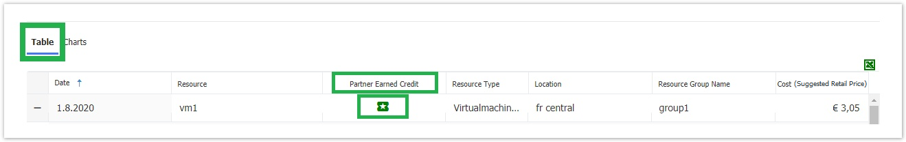
Export Azure Plan's Historical Data of Usages Through Subscription View
The cost management section contains also an excel icon, where the Storefront user is able to export and download the selected data from the Table view. The file's name consists of the following data <Scope's name_BillingPeriod.xlsx> i.e. "Azure_Entitlement_Last_7_days". In an upcoming release, the file name will change to "Azure_Entitlement_01-08-2020_to_31-09-2020". Please note that the excel file contains one worksheet. 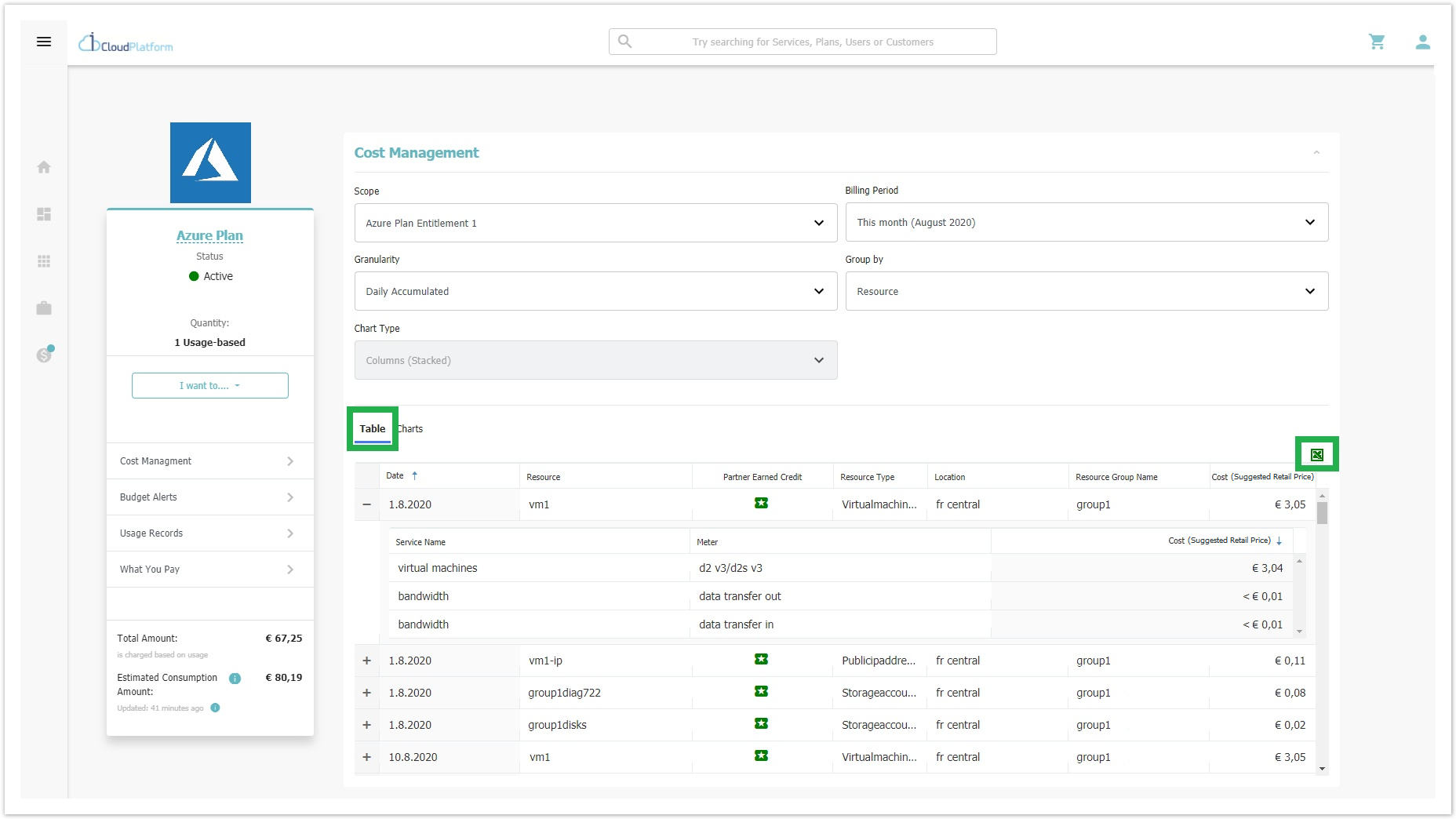
The summary of the information listed in the worksheet are defined based on the selected Group by option.
For example, the following information is listed when the selected "Group by" option is:
| Group by Options | |||||
|---|---|---|---|---|---|
| Exported Excel File Columns | Resource | Location | Meter | Resource Group Name | Resource Guid |
|
| ||||
| |||||
|
| ||||
|
| ||||
|
| ||||
|
| ||||
|
| ||||
|
| ||||
|
| ||||
|
| ||||
|
| ||||
| |||||
| |||||
| |||||
| |||||
| |||||
| |||||
Tags Column Availability in Exported Excel File
* When the Group by option selected is the "Resource Group Name", then the Tags column will be displayed, only in the exported excel file, with one or more tags that were added by the customer during Resource group creation. Multiple tags will be separated by a comma. Also, a tag consists of a name and a value and is being displayed with the following format "<name>:<value>".

Cost Management Charts
In the Cost Management Charts tab, you will find the main bar chart as well as three (or one) pie-chart(s) which, as a whole, represent the cost management data in a visualized way. This tab is selected by default during the first load of Azure Plan View in Storefront. The default "Scope" option, upon revealing the Cost Management Charts tab, is the Azure Plan.
Cost Management Bar Chart
The bar chart consists of a horizontal axis and a vertical one. The horizontal axis of the graph always shows the time while the vertical always shows the cost, based on the account's culture.
All the bar chart's filters (Scope, Billing Period, Granularity, Group By) have the same default values as analyzed above.
However, there is an additional filter called Chart Type which defines how the chart will display the relevant data. For now, this filter has by default the value Column (Stacked). In later versions, more values will be added.
Forecast on Bar Chart
The reason for the existence of forecasts is to display an estimated prediction of upcoming spendings within a chosen "Billing Period", based on trends. Forecasts, therefore, provide the Storefront user with an indication to better manage the resources of the chosen entitlement in the future. There are cases where a forecast can appear during the current day. This means that the final updates of data consumption from Microsoft for the current day have not yet been arrived and calculated by the system.
Since we display the days in the horizontal axis of the whole month, for the future days we show stacked columns for a forecast of every entitlement. The forecast for each entitlement is placed in green color. For instance, we display the Cost (Suggested Retail Price) of "Entitlement 2" in blue color and the corresponding Forecast of "Entitlement 2" in light blue.
When mouse hovering over a specific stack, we display a block with the name, the forecasted cost (Suggested Retail Price) amount, and the date of the entitlement in bold as exemplified in the following image:
Cost Management Pie Charts
Under the basic bar-chart, the Storefront user can find one or three additional pie charts in order to view the usages already consumed either per Entitlement (for Azure Plan "Scope") or per service name, per location or per recourse group name (for Entitlement "Scope"). These pie charts change only when the scope is changed and/or when the billing period is changed since they have their own grouping by default.
- Pie Chart based on the "Scope" Azure Plan

- Pie Charts based on the "Scope" Entitlements

When the scope is an Entitlement, as per the above screenshot, three distinct pie charts are being displayed and show the cost (Suggested Retail Price) consumed until now, whereas when the scope is the Azure Plan, a single pie chart is being displayed and shows the cost consumed by each Entitlement contained within the Azure Plan until now. This is also part of the default view when the Storefront user is redirected to the Azure Plan subscription's view during the first load of the Cost Management.
Every pie consists of:
- A filter for grouping.
- Relevant data and indicators.
- A legend for the pie chart's data.
Usage Costs Calculation
For the usage costs, appearing in the cost management section, the calculation is the following:
The unit price of Microsoft (in USD) is applied in addition to the Microsoft Foreign Exchange Rate per resource. Then, taxes are applied (if you display taxes in your Marketplace), and is then rounded up to two decimals. The price-list margin or markup or any other price list rules are not applied in the Cost (Suggested Retail Price) depictions neither in the table nor in the charts since we want the system to be in agreement with the billed amount shown in the Microsoft Azure Portal. The price will be shown on the Storefront user's currency. Please note that the system does not keep historical data.
Cost Management in Tenant Resellers
The Cost Management section is displayed with the same rules as in the Azure Plan Subscription view, in the Tenant's Storefront.